Newmarket Royals
Arena Name: Newmarket Recreational Complex
Capacity: 3700
Built: 1985
Address: 100 Eagle Street, Newmarket, ON, L3Y 1J4
Last Game: 1994
Ice Surface Size: Regulation
OHL Championships: None
Memorial Cup Championships: None

Newmarket Recreational Complex

What Was the Arena Like?
When the Cornwall Royals left their Eastern Ontario home and headed for Toronto's York Region, it was supposed to be a move back into the heart of the province's biggest city shortly after the legendary Marlboros had left. Yet, in a precursor to the league's later troubles marketing the game in the endless GTA suburbs of Mississauga and Brampton, the Royals only lasted two disastrous years at the Newmarket Recreational Complex before giving up and moving to Sarnia. Suburban Toronto, it would seem, has never been particularly interested in junior hockey.
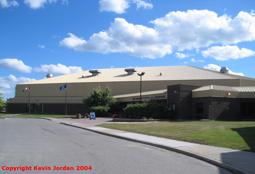
The now-renamed Ray Twinney Complex sits near the junction of Highways 11 and 9 in a laid-back, bucolic setting in suburban Newmarket. The complex sits on a hill, surrounded by soccer fields and baseball diamonds, and its neighbours are mainly commercial campuses and suburban housing. The arena itself is a large, 1980's building in brown brick aluminum siding that was yellow in the Royals' tenure, but has since been repainted blue. The complex also includes a community centre and a pool in addition to two ice pads.
Inside, there is a lobby which divides the two halves of the complex. The arena entrance is on the left, and leads into a concourse painted in sky blue and white. There are a collection of pictures hung on the walls of the arena detailing the teams who have called the place home over the years, including both the Royals and the AHL's Newmarket Saints. The concourse empties into the arena bowl at ice level at a number of entrances.
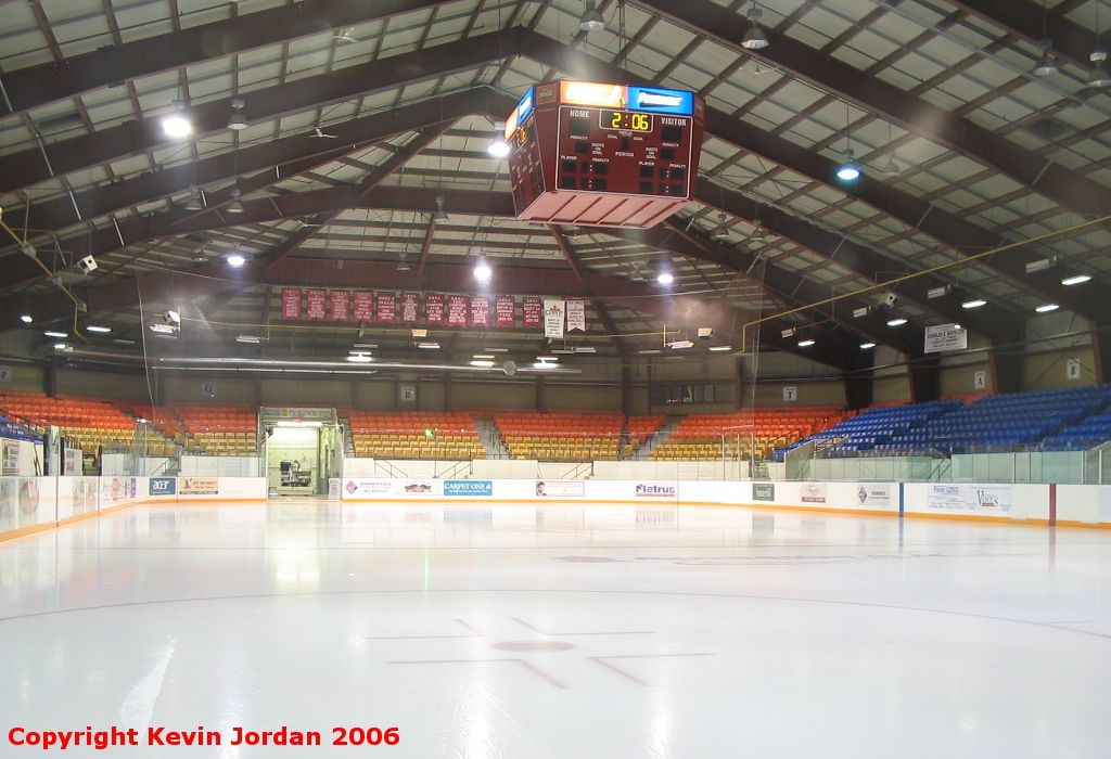
Once inside the bowl you find yourself in an ice-level concourse that leads up into a smallish seating area raised above the ground. The seats are all newish and blue. There is a press box overhanging on one side of the ice, a functional clock, and banners hung at both ends of the building. There is also a top-level concourse that can be eliminated in favour of a few more rows of temporary seating.
I made one trip to the Newmarket Rec Complex back in 2004 and then didn't return for 21 years. But late in 2025, rumours were starting to abound that the OHL was considering making another trip into York Region, so I came back, this time to see a Hurricanes game against Lindsay. Apart from paint, the building really hasn't changed much in 21 years, but the biggest thing I noticed was that the rink isn't any worse than Brantford was when the Bulldogs moved in. It would take a lot of money to bring the building up to current OHL standards, but the space is there, it's just a matter of will. If the OHL wants back in York Region badly enough, this rink absolutely could serve as a temporary home to a contemporary OHL team.
I am generally in favour of markets getting a second chance, but it's hard to imagine the OHL ever being successful in the Toronto suburbs, particularly when the Barrie Colts now exist a mere half hour or so away. But if the league does decide to return, Ray Twinney Complex (along with Cornwall) is one of the few rinks in the province that could be brought up to current standard on a temporary basis. We shall see if it comes to pass.
Inside Newmarket Recreational Complex

What's the Arena Used for Today?
The Newmarket Recreational Complex has since been renamed the Ray Twinney Complex, after the former mayor of Newmarket. It's used for minor hockey and is home to the OJHL's Newmarket Hurricanes.
Thom Racine says:
"When I switched the page to the Newmarket site and read your description I had to chuckle out loud when you asked...Who designed that logo. Answer - I did.
"I spent the final six years with the Cornwall Royals as the colour commentator for the radio broadcasts and will say without a doubt it was a very sad day when the club left. Mismanagement and a smoke screen sent the team to Newmarket and all the history with it. We still have our memories of the team and the championships and the great players though. During the Royals' final season, we were in Sudbury on a two game trip. Sunday in North Bay and Tuesday in Sudbury. On the off day at breakfast the team governors were wondering about a new logo for the following season. Although the Royals logo was unique it was a little simplistic for the new age of team logos as they parlayed to marketing. I left the breakfast and in my hotel room made use of the rainy day outside.
"I knew the name was not an issue and drew a few crowns as in the original LA Kings logo. It looked a little too Swedish. I even did a plain name logo with Cornwall down the front like the Rangers or Pittsburgh's versions and suggested we keep the stars on the sweaters but move them to the shoulders. I did the same design and suggested the original logo be placed on one shoulder like the Canucks do today with their great old logo. I had seen a picture of the new (Gretzky Era) Kings logo with the speed lines through it and came up with pretty much what you see today. As well as the stick on top I remember doing one with a crown hanging off the R and Cornwall of course went across the top. The other thing was that I don't remember boxing the logo in. It looked good in the Kings design but not in this new look. It was more free-flowing to emphasize the speed lines. I think that is what cheapens the look because when it was finished that day everyone liked it. I gave them to owner Willy Wise and told him that they were only ideas that would have to be tinkered with and that surely someone could come up with a cleaner look or maybe something entirely different. I kept a few small sketches but they went by the way side a few months after the team left. It was my only evidence that I had anything to do with it other than our play-by-play guy and some of the players. Not that it really mattered that much. Within those months the deal to move the team was made and the OHL needed immediate updates and I guess Willy must have kept the originals and submitted one of my drawings. When I first saw Newmarket's logo I could not believe it. He didn't even ask me - not that he had to, and we really were not on good terms anyway. In a odd way though I was pretty happy that that rainy day in Sudbury was not all for nought."
Feedback
If anything is incorrect or you have something to add, please e-mail me at  and I'll update the guide.
 and I'll update the guide.
Copyright © OHL Arena Guide, 2002-25.
All rights reserved.
Last Revised: December 21, 2025